MTA
New York City MTA_System Design & Data Visualization
During the MTA’s monthly board meetings, internal teams often use unfamiliar terms to describe the subway system that decision makers don't understand. To alleviate this, we created a system of visual elements for decision makers to use as a tool during meetings enabling them to better understand what portion of track is being discussed. This system is medium agnostic — it can be applied to interactive maps, turned into a printed key, or used to compare data sets for decision makers to reference during meetings.

Currently, data is distributed monthy via b&w booklets

The MTA consists of over sixty track segments


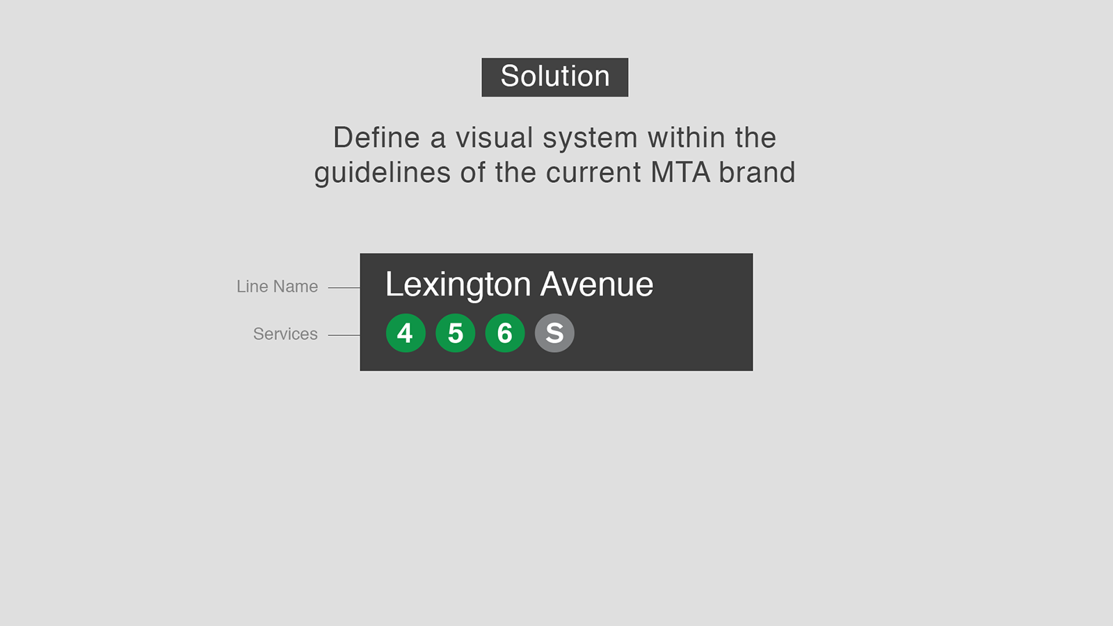
Using data from the MTA, we sketched out a prototype map that included endpoints, names, and train services for every internally used line name. For example: the Lexington line encompasses the 4,5,6 and Times Square shuttle services, between Grand Central station and Borough Hall station. We soon realized that this was too much information to show at once, and instead designed a flexible system of elements for MTA teams to use across a variety of use cases. Labels from our system can be used to quickly compare service issues and trends across lines. The visual map elements -- endpoints and lines -- can be used to create reference maps for print or digital interfaces. Whether the elements we designed are implemented for dashboards, interactive reports, or print references, they share one goal in common -- creating a common language for MTA decision makers to discuss and organize data during important planning conversations.


Top-level view of a track segment

Zoomed-in view showing a line and its services

Multiple lines and their services
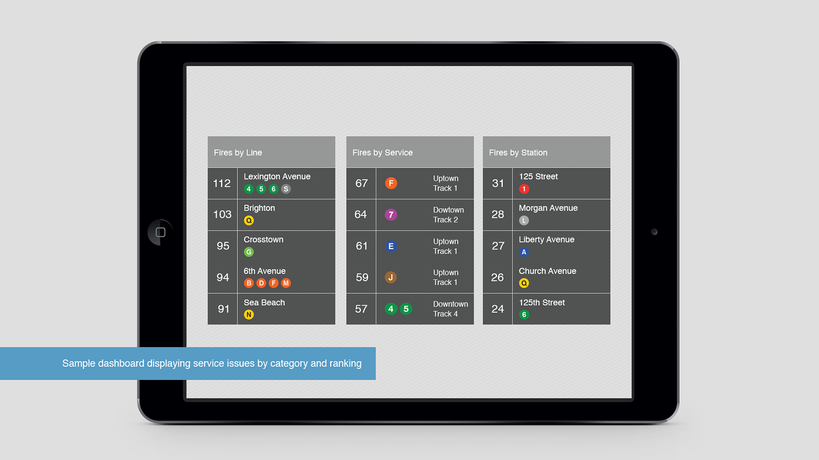
The design system used in various data sets